Snam.
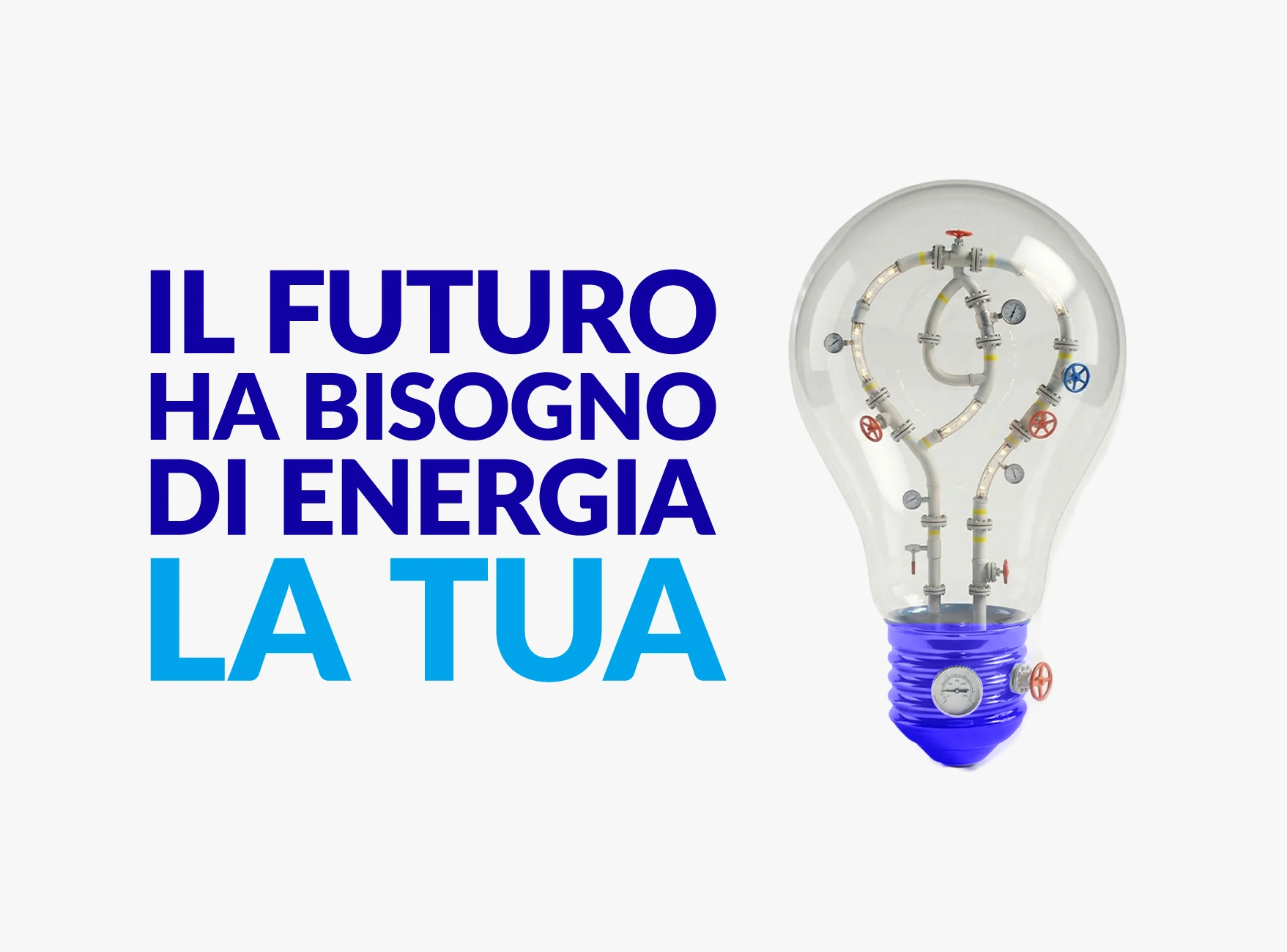
The future needs energy. Yours.
An employer branding campaign that reimagines Snam's industrial world to tell stories about people, values and the energy behind the future.
Art Direction · Visual System · AI Production
Same brand.
New audience.
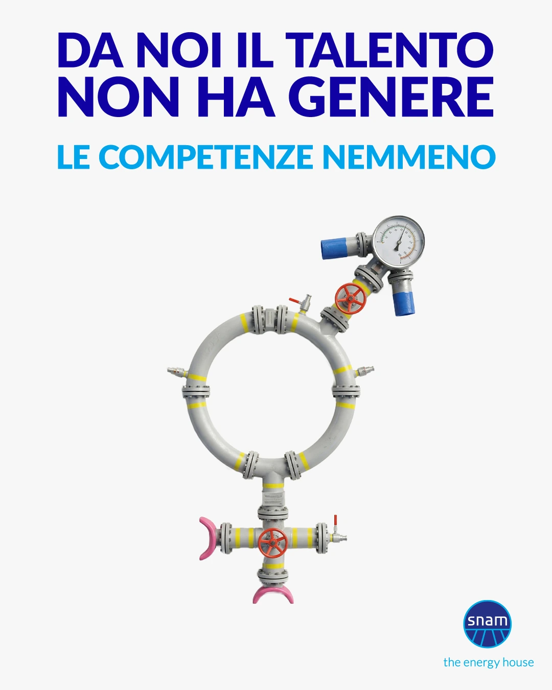
Snam already had an established employer branding campaign built around familiar symbols made from industrial components.
While the original concept continued to work offline, the brand needed a fresher visual approach to connect with younger audiences across digital channels.
The challenge was to evolve the existing creative language without losing what made it recognisably Snam.
An established idea.
A new visual direction.
The starting point was already there: everyday symbols reimagined through Snam's industrial world.
I built on that concept, exploring new compositions, materials and visual treatments to give the campaign a more contemporary and cohesive look.
Pipes, valves and industrial fittings became part of a refined visual vocabulary, connecting different messages through a consistent creative direction.
The idea stayed familiar. The execution moved forward.
Different messages.
One visual language.
The refreshed direction brought a stronger sense of consistency to the campaign's visual executions.
From training and collaboration to equality and innovation, familiar symbols were reconstructed using a shared approach to materials, lighting, composition and detail.
Each visual had its own message, but all belonged to the same recognisable world.
A more cohesive system, designed to bring Snam's employer branding into digital communication.
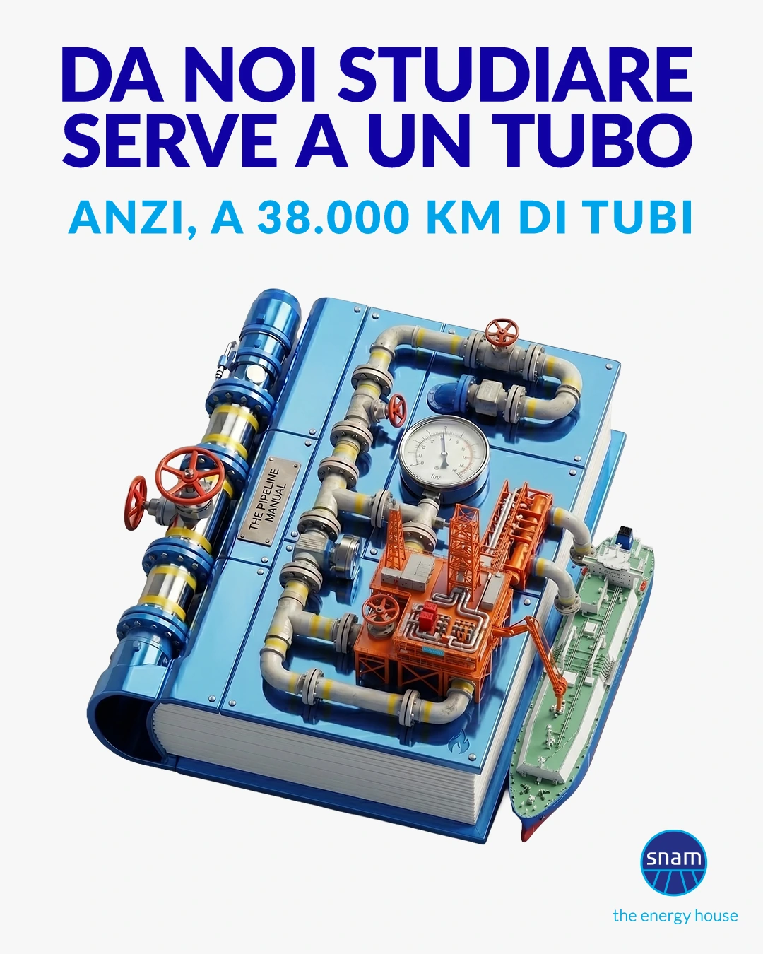
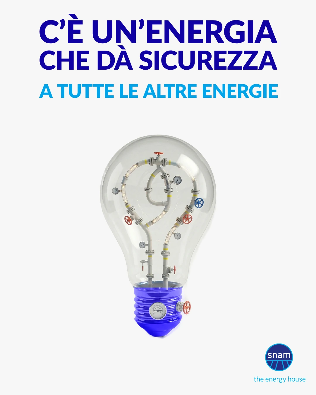
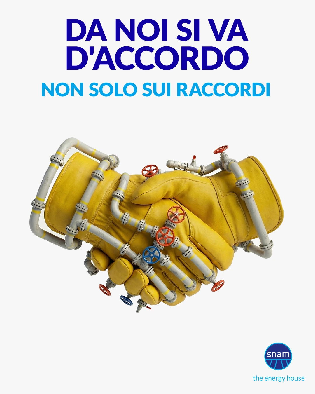
Trial. Error.
Refinement.
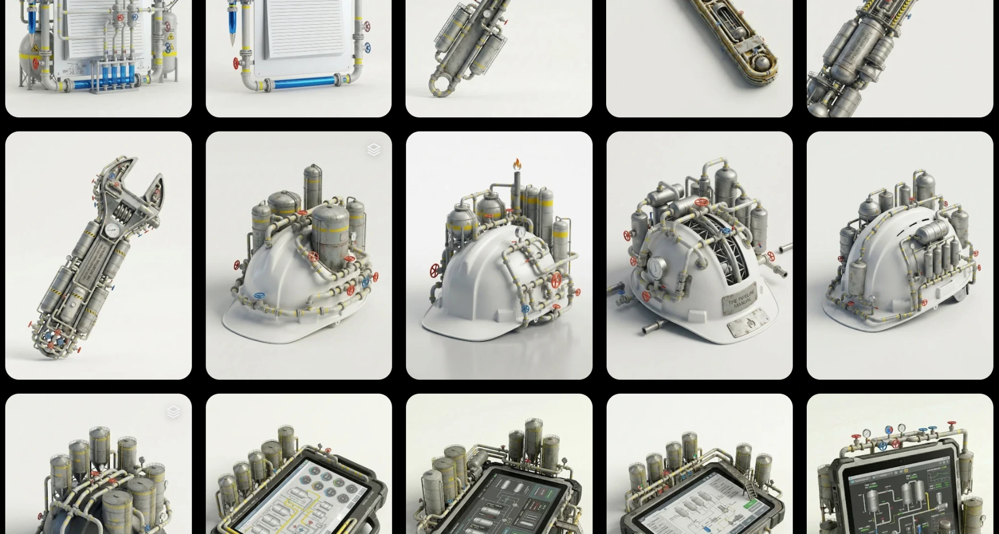
To evolve the existing campaign direction, I used Google Flow as an exploration tool.
It allowed me to test shapes, compositions, materials and visual structures, gradually refining how Snam’s industrial vocabulary could become a more cohesive and recognisable digital system.
The process wasn’t about generating endless variations. It was about identifying the visual logic that could make the campaign feel more contemporary, consistent and fit for social communication.
Once the direction was clear, the selected executions were refined through a traditional Adobe workflow.
AI helped explore the possibilities. Art direction shaped the system.
- Client:
- Alkemy for Snam
- Project:
- Talent Attraction Campaign
- Type:
- Employer Branding / Digital Campaign
- My Role:
- Art Direction, Visual System Development, AI-Integrated Production
- Scope:
- Visual Direction Evolution, Campaign Key Visuals, Social Content
- Tools:
- Google Flow, Adobe Creative Cloud
- Status:
- Delivered — Published on Snam's official social channels